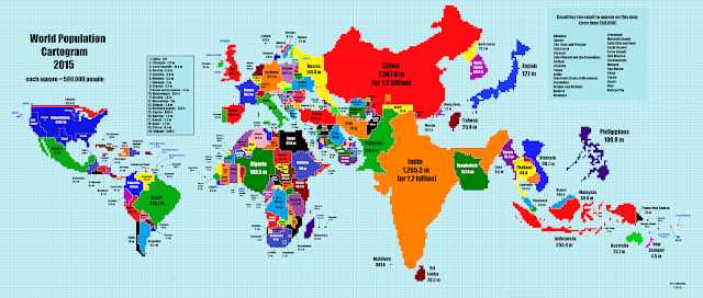
Holy crap China and India! You all need to keep your peckers in your pants or start wrapping them in a rubber! Holy crap, you're going to exhaust the planets resources if you don't! How can so many people fit on such a small amount of land in the first place? These numbers are just mind boggling!
Another thing that surprised me was the population difference compared to land mass between Canada and the U.K.. I would have never thought there would be such a difference.
You can read more about the maps over at IFL Science. It's a neat site to frequent if your into this sort of stuff. I am, because I Fu*ken Love Science! ;)
What are some surprising differences that threw you for a whirl? Put them in the comments below.
#Population #Map
#Population #Map


0 Comments
Say Something